Tuesday, 8 May 2012
Tuesday, 1 May 2012
A different sense of feel
Afterwards I experimented a bit more with different effects and came up with some interesting results.
Here a purple undertone has been added creating a more colder feeling and effect in the pattern
I actually quite like the effect of this with the colour overlay and the burn blending effect. It definitely has a more autumn and crisper feel to it. I did notice an obvious track mark which will need to be fixed.
This was created by changing the opacity levels of both the pattern level and the background level which had been filled in a light green colour and blended with the 'darken mode'.
This is similar to the previous one, only this time with an added layer of colour - this brown, with an adjusted opacity and using the 'overlay' blending effect.
I truly like the effect of this as it has a warmer undertone to the design, retaining the wonderful colours and tones of the different dried petals while still giving the slight crisp autumn feel of the earlier colourings.
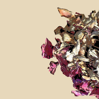
I had a sudden idea of combining two different types of repeat into one - using the old rose motif previously created:
This was just roughly created to get a sense of what it might look like. I don't mind it, it actually looks quite cool with the contrast however it may feel a little clutter and with too much going on. It may look better if the toss background was changed to a duller tone or with a high opacity. While it does at more dimension to the work I feel I this stage I would probably leave out the rose for now.
Still tossing and turning
I cut out new pieces from the original photos taken
I also changed the artistic filter to poster effect and manipulated the settings to create clearly defined tones, thicker lines and heavier shadows.
After alot of copying, pasting, dragging and turning I managed to come up with this repeat that looked promising.
This was the result after testing the repeat:
I was quite pleased with the result as I felt it was much better than all the previous attempts. There are minor areas where it seems as though there are track marks -- I will fix those up.
Tackling the challenge. Take 2
Reattempting to master the repeat, I continued play around with it and adjusted bits and pieces.
This was the result when the repeat was tested:
While it was better than the previous few, there are still some places where track marks are still visible. The most important thing from this I feel are the deep purples that aren't spread out evenly enough and turned in at different angles enough. The way it is now I think makes it more obvious as to where the pattern starts and finishes.
Another attempt to fix this:
However still unsuccessful.
At this point I was fed up and decided to start afresh.
Attempting the challenge. Take 1


I decided to try creating a toss repeat starting off these these two images of dry, fallen and withered petals and leaves. This way I felt that I could portray the idea of slow change and decay in nature but at the same time the beauty of it. These are the cut out motifs that have been manipulated through the rough pastels filters.
This is the working pattern with the motifs copied and rotated
And this was the result when the repeat was made into a pattern. There are several track marks that are clearly visible- hence there needs to be a lot of adjusting done.
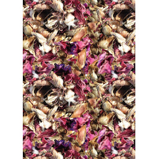
Later I realised that I had used the wrong method. I had created my own box in the middle of the page to fill with the motifs and i cut and pasted the areas that stuck out of the box from all sides, rather than the two and corner, shown in class.
I tried using the proper method and after a long time adjusting this was the repeat.
This was the result after testing the repeat
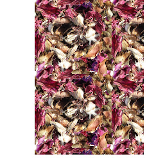
For some reason the track marks in this were much more worse than the first time.
In this attempt, I didn't bother filling in the middle of the motif with layers of petals- I just wanted to test if how I was cutting and dragging the outside parts into the repeat box was better this time round. Unfortunately it wasn't.
After more adjustments, this test demonstrated that the repeat wasn't quite right it is clearly visible how the pattern is created and the track marks are pretty obvious.
After this, I was fairly frustrated, called it a day and decided to try again later, hopefully with more success.
Experimenting can be fun... sort of.
On my second attempt, I chose to use this image just to experiment with as I liked how the subtle change and slow process of decay was evident in this flower.
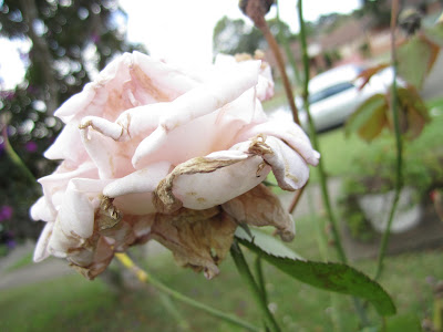
Focusing the idea of decay and autumn, I wanted to place emphasis on the withered layers of petals underneath. Using the lasso tools I outlined the rose, making it a motif and slightly changed the colour of the rose.

Focusing the idea of decay and autumn, I wanted to place emphasis on the withered layers of petals underneath. Using the lasso tools I outlined the rose, making it a motif and slightly changed the colour of the rose.
Playing around with the effects, using the poster artistic filter and shadows I created this where most of the rose was in block colours, lacking detail and more like a cartoon - this contrasting the more detailed and real form of the dried out petals beneath.
This next one is a similar attempt to draw attention the the bottom petals using the paint daub filter. While very pretty, I feel as though its too realistic for what I imagine a textiles print will look like. I do however particularly like the detail of the most front petal, drying and curled- its delicate nature and brittleness depicted well.
This pencil effect I think is really interesting and effective. This is a effect I will consider - like its almost lineo block effect and the blended shades of colour coming through.
This 'cut out ' effect of the rose is very similar to the poster effect. Something like this I feel is more suitable as a motif for a print. I particularly like the way the different tones of colour and clearly defined with this effect.
I also played around with the neon effects and I love the results. I think its stunning and the detail of lines and colour within each petal is spectacular. I love the eerie and surreal feeling it emanates.
As much as I really like this motif I feel to create a pattern simply using this may be too simple so while I will keep this in mind- I will continue to experiment and generate other ideas.
Testing the waters
Initally, I decided to start to play around with this image of the petals scattered in the grass. I went it filters and changed the options and settings, creating soft pastel effect for the image
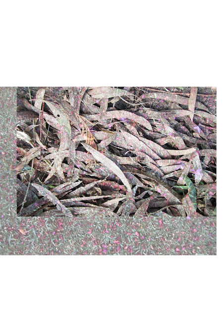 I then added this image ontop as an overlay adjusting the opacity and tried different blending modes
This was the end result. After playing around with this image I realised it was impossible to create a repeat image if it remained as that untouched square. Although interesting I didn't feel this image would do much and I eventually decided to scrap this experimental idea.
Subscribe to:
Comments (Atom)


